Enhance Mobile Navigation with Responsive Select Menu
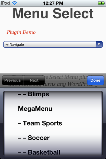
The Responsive Select Menu plugin for WordPress is designed to improve mobile navigation by converting standard menus into a select box format. This change is particularly beneficial for touch screen devices, allowing for easier navigation while conserving screen space. The plugin works automatically without requiring additional PHP code, making it user-friendly for WordPress site owners. With its highly configurable options, users can tailor the menu's appearance and functionality to meet their specific needs.
Key features include the ability to set a width breakpoint for when the menu switches to the select box, select which theme locations to apply the menu, and configure how many levels of submenu items to include. Users can also customize the character used for indenting submenus and decide whether to exclude items without links. This plugin offers a seamless integration with any UL-based WordPress 3 menu, ensuring a versatile solution for enhancing website navigation.